I remember watching a speech from Steve Jobs where he specifically said he learned about calligraphy or typefacing (I don’t remember the specific terms) to implement proper font rendering on macs. This was also before OSX came out.
It was interesting because I realized how subtly difficult font rendering is. Unless you’re using a monospaced font all of the characters have different widths, you have to figure out how to split text into lines, or how much to space text if the alignment is set to justify. In some of the fancier fonts on macOS, the characters actually change slightly if there are other characters nearby.
If I recall, what he was really saying was - when he was in college, he chose to go to some classes that weren't required, but were interesting to him, personally - one of them was on typography. He learned a bunch of non-obvious things about how fonts are designed, and how they use things like serifs for legibility, etc, etc - just this huge swath of things that he didn't necessarily "learn in depth", but he became aware of the existence of, and aware of why anyone ought to care that they exist.
So then a few years later, he's running a computer company, and it's the heyday of greenscreen, monospaced fonts. And a lot of people - without this connection to the font-making culture of western history, genuinely thought that's perfectly fine, no room-for-improvement, etc. Monospaced stuff was honest, straightforward, industrial - it didn't waste any effort on silliness like "looking pretty" (very much like soviet brutalist architecture).
As a manager, he was able to at least greenlight the idea of "wasting money" (lots of it, in fact), on decent typography, because, thanks to that education, he understood it wasn't just being done to make stuff prettier, but was actually being done to make it easier to read. That there was a powerful, utilitarian reason to do fancy fonts, not just an aesthetic one.
I don’t think it was specifically for the Mac. I think this might be from the speech he gave at Stanford where he talked about dropping his required classes and going to ones that he just was interested in. He later applied what he learned though.
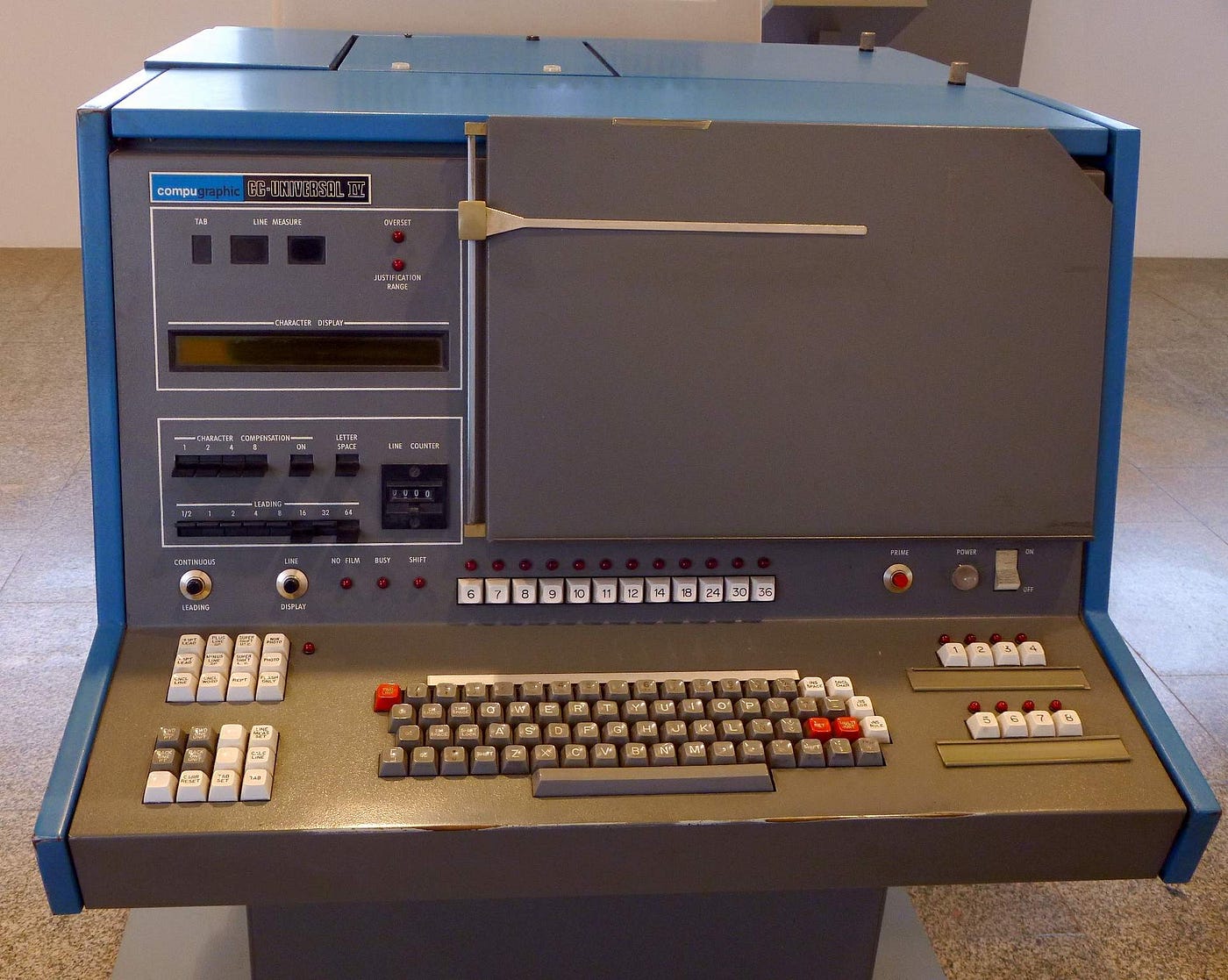
There was a whole typesetting industry doing this in the 70's, with a typographic quality still unsurpassed by today's computers: AutoLogic APS-5, Compugraphic, the Pegasus font system running on DataGeneral minis.
It was interesting because I realized how subtly difficult font rendering is. Unless you’re using a monospaced font all of the characters have different widths, you have to figure out how to split text into lines, or how much to space text if the alignment is set to justify. In some of the fancier fonts on macOS, the characters actually change slightly if there are other characters nearby.